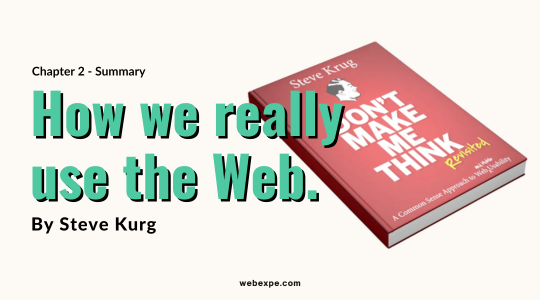
Don`t Make Me Think revisited by Steve Krug - chapter two summary
Did you know, only 16% of your website users read word-by-word?
Then what about the rest 79% ? Well, they SCAN! 📜👨💻
Ever assumed that every user will use the Webpage that you designed, exactly as you intended? Ever had a hilarious moment during a usability test when a user clicked on something totally unrelated or inappropriate? 😆
But the truth is, users don't always use websites the way we expect them to.
Krug helps us understand, if you want to design effective Web pages, you have to learn to live with ⬇️
The three real-world Web use facts
-
We don't read pages. We scan them.
First fact about the Web use is that people tend to spend very little time reading most Web pages.
They skim the pages and look for words or phrases that catch our eye. It is a natural reading pattern.
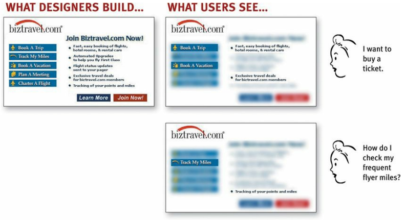
Why do users scan?
- most users want to get their work done quickly. Users act like sharks: They have to keep moving, or they'll die.
- Users are only interested in a fraction of what's on the page that matches their interest or what task they intend to do on the webpage.
- Do you know 🤔, scanning is a natural process for humans? We learn it right when we learn to read. In fact, we are pros at it! We all have been scanning books, facebook, instagram.
-
We don't make optimal choices. We satisfice.
When creating pages, we assume that the user would quickly scan the page, weigh their options, and select the best one.
But in reality they just select the first reasonable option that might lead to what they are looking for. This is called satisficing.
It is not always true that users never weigh their options, it depends upon what is in their mind right now? how much time they have ? and how much confidence they have in the site!
why don't Web users look for the best choice?
-
users are always in a hurry.
-
There is no penalty for guessing wrong. Even if they clicked on an option that didn't give them what they wanted, they can always come back via back button.
-
BTW do you know 🤔, Back button is the most used button in a web browser.
-
Guessing is more fun. Guessing is less work than weighing options. Users don't want to put in brains. They want to do easy tasks that can lead them to what they want to achieve.
-
We don't figure out how things work. We muddle through.
While using any kind of tech, people tend to not read the instructions and jump in and explore it without understanding how it works.
Krug also playfully says that-
I wouldn't be surprised if even Mark Zuckerberg and Sergey Brin have some bits of technology in their lives that they use by muddling through.
Why do users muddle instead of understanding it first?
- Most of the users don't care as long as they can use the website and get something meaningful out of it.
- If users find something that works, they stick to it. It doesn't matter if there's an alternative that can get the same job done in lesser steps. They will only shift to an alternate solution, if they accidently find one.
Conclusion
The second chapter of "Don't Make Me Think Revisited" has taken us through the three facts about how a user uses a website. I will be writing more such articles on further chapters of this book, so stay tuned! 😎


